in association with
and
presents:
AlphaBEST
Brand Refresh
AlphaBEST has been a top provider of high-quality after-school education for a long time. More than just babysitting and homework help, AlphaBEST provides a carefully curated, ever-changing curriculum that taps into children’s innate sense of wonder. Every day, students get to revel in the excitement and joy of experiential learning that enables them to connect to the world around them through innovative explorations into STEM, language/culture, arts, fitness, social-emotional learning and more. But creating a look and feel, on a brand level, that incorporates all these aspects while being able to entire three separate audiences (school districts, parents and children), is no easy feat.
That’s why AlphaBEST turned to UpperNinety. With a fresh strategy, our team got to work to build a new brand identity that reflected their goals and core values while simultaneously separating themselves from their competitors. And to ensure Kaplan’s brand identity was in sync with their new mission and vision, UpperNinety was enlisted to refresh the entire look of the Kaplan brand in a way that reflected their newly established core values. The end result really drives home their focus on curiosity and innovation, yet it’s malleable enough to be worked into any specific audience.
Personal attributes of the brand
Working closely Jenny Rowland, the purveyor of expert brand strategy work at The Dot Collection, UpperNinety created a thoughtful brand persona that would give us the framework we needed to ensure everything from copy to the overall tone of the AlphaBEST brand worked hard to establish a poignant identity.
Curious
It takes a special kind of adult to respect and encourage the curiosity of a child. AlphaBEST understands the beauty of a child’s imagination, because we’ve never forgotten it ourselves. This is what leads us to chart a different course to after school care. We remind children that their wonder is a gift, and it can help them to become compassionate and engaged citizens of the world, just like we aspire to be.
Innovative
At AlphaBEST, we respect the role of school-hour teachers, but we are not chained to any standardized tests. So we take an innovative approach to after school. Our unique approach to education is all about making learning fun again. Through challenging and exciting activities, we spark curiosity to encourage a lifelong love of learning.
Nurturing
Everything we do has one goal in mind: helping children live up to their potential. In a safe environment filled with connectivity and discovery, we help children become more secure in who they are and promote positive growth.
Fun
Every activity we plan is built around the idea of fun. We want kids to experience joy and exhilaration in the pursuit of learning. We let them explore and discover, all while helping them create an ongoing connection with the world around them.
a new, inspiring manifesto
With all the great strategy work and brand attributes in place, it was time for a new manifesto. Something exhilarating and inspirational for staff, educations, parents and students alike. And it might be our favorite we’ve ever written:
We stand for the curious, and long may they explore!
There’s power in a child’s wonder —
A sense of awe that propels imagination forward,
Creating a world of endless possibilities.
In an increasingly divided society,
We help kids find connectivity through discovery.
Collaboration through adventure.
Inclusivity through innovation.
We believe in every child’s future.
A future built on understanding, knowledge and creativity.
On greater discovery and thoughtful connections.
On acceptance and belonging.
This is why we challenge kids.
Why we engage them.
It’s why we provide a safe, nurturing environment.
A space where joy and excitement drive experiential learning.
A space designed to grow minds and expand horizons.
A space where teaching to a standard ends.
And teaching to life begins.
We help kids become connected to the world.
We teach them to be secure in their identities and empowered by their potential.
We let them have fun.
And we’re all better for it.
So join us.
Bring your ingenuity.
Bring your curiosity.
There’s an amazing journey ahead of you,
And we can’t wait to see where you’ll go.
A new visual identity
The new AlphaBEST visual identity needed to be a hard left turn from what they’d been relying on for the past decade, and our creative partners at Wilder& set out to make something as unique as our client. It needed a new color palette that reflected the sense of wonder they bring to their unique curriculum, but it couldn’t be such a departure that people no longer recognized the brand. To accomplish this, we held onto some of AlphaBEST’s original core colors (orange, sky blue, navy and yellow), but we punched up with some new colors like teal, fuchsia and purple. Think about the whimsy you experience when you first dive into a new, 48-count box of crayons.
Add to this smartly chosen photography rules and a new set of proprietary visual elements, and that path for a successful transformation formed right in front of us.
an inspiring typeface for all occasions
AlphaBEST has a wide range of audiences to accommodate, so any typography must be able to do some heavy lifting, while simultaneously complementing the logo, creating high visibility across print and digital executions, yet still managing to have a sense of fun. That’s why we’ve gravitated toward Avenir Next — a typography that works well in all settings and readers, from children to parents to school administrators.
A SUBTLE UPDATE TO THE LOGO
AlphaBEST’s original logo did a lot of heavy lifting already, but we wanted to give it a more modern feel, so we eliminated the stars that took up space at the top and reworked the color of the back half of it. We also wanted to make the descriptive lockups work a little harder, so we widened them to take up more space beneath the main logo.
So we started here:
And we took it here:
let’s take a look at how the pieces form a whole.
With a new brand identity agreed upon, it was time to start bringing it all together to see how it would look through a variety of executions.
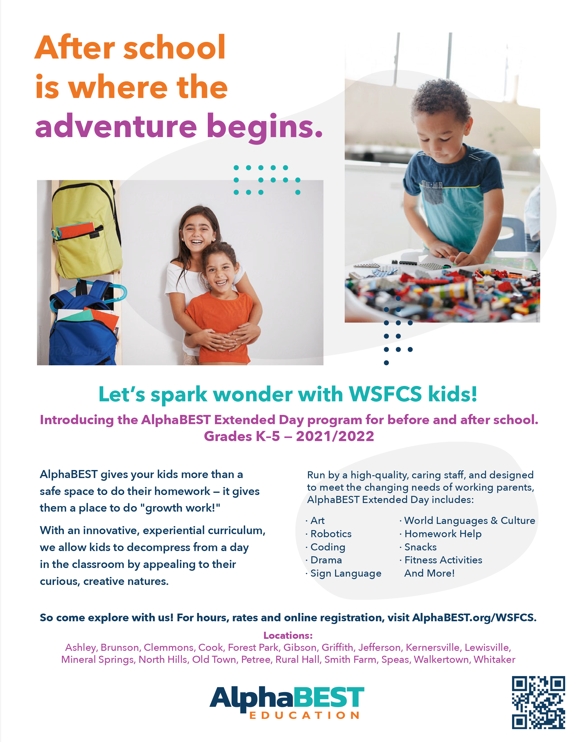
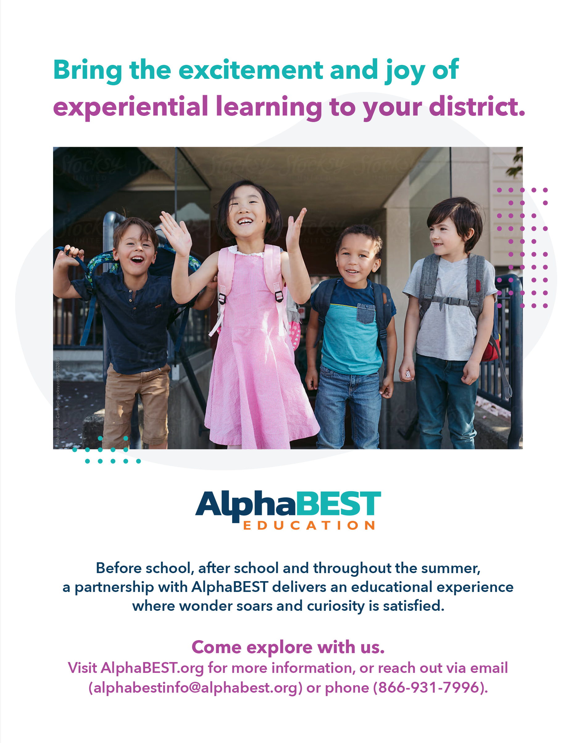
Flyers
Whether it’s heavy on color and images or using a smart amount of negative space, you can see the AlphaBEST tone shining through. Monoline design elements create real motion on the page, the dots invoke the feel of making connections, and the photography always harkens back to the color palette.
Conference Space
AlphaBEST finds itself showcasing its potential at a variety of conferences and trade shows, so we developed a new, standout booth that puts their identity on display.
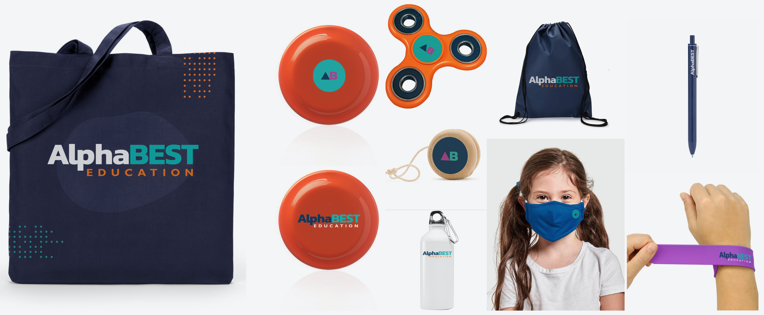
Promotional Items & Giveaways
We wanted swag that actually said something about education and/or child interests, as well as putting the new brand identity on display, so we thought through pieces that actually made sense for AlphaBEST.
Website
Normally, we’d just show you some of the pages we created for AlphaBEST right here, as we often works with clients who have in-house developers and designers who can complete the site based on our idea. But AlphaBEST was so enthralled with the work we did, they ordered a complete website from us. Click the button to check it out!
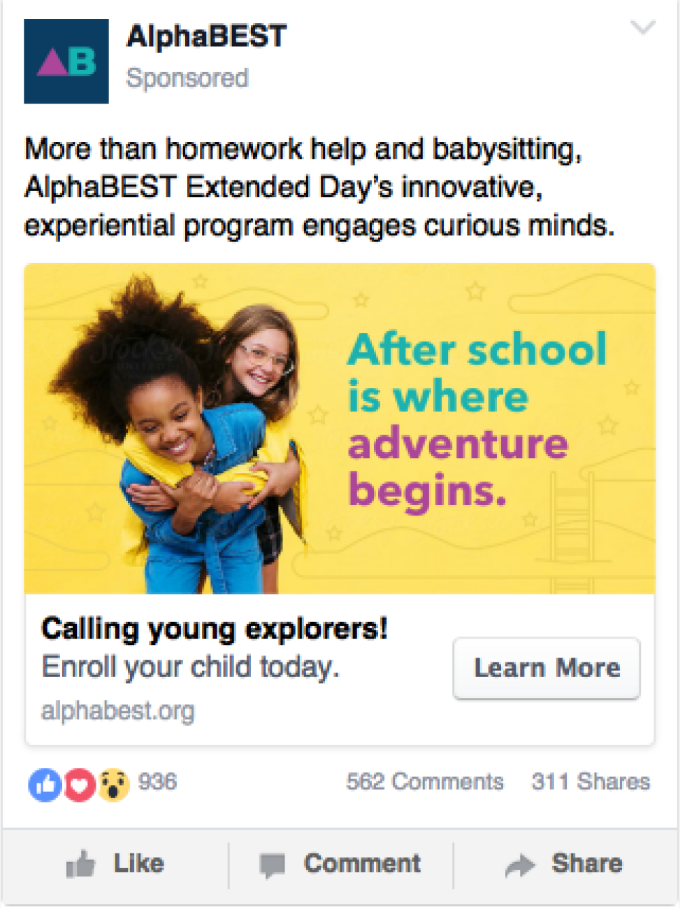
Digital Ads
We gave AlphaBEST two different ways to move forward with digital advertising, showing them how to use images and how to implement text-only ads, always ensuring the brand identity shines through.
Social Media
To take the new branding into the social space, we developed templates and direction that help AlphaBEST make the best use of their social media. We also created an abbreviated logo to use as a social icon.
Email
Emails were designed to ensure the AlphaBEST philosophy shines through with every new message sent.
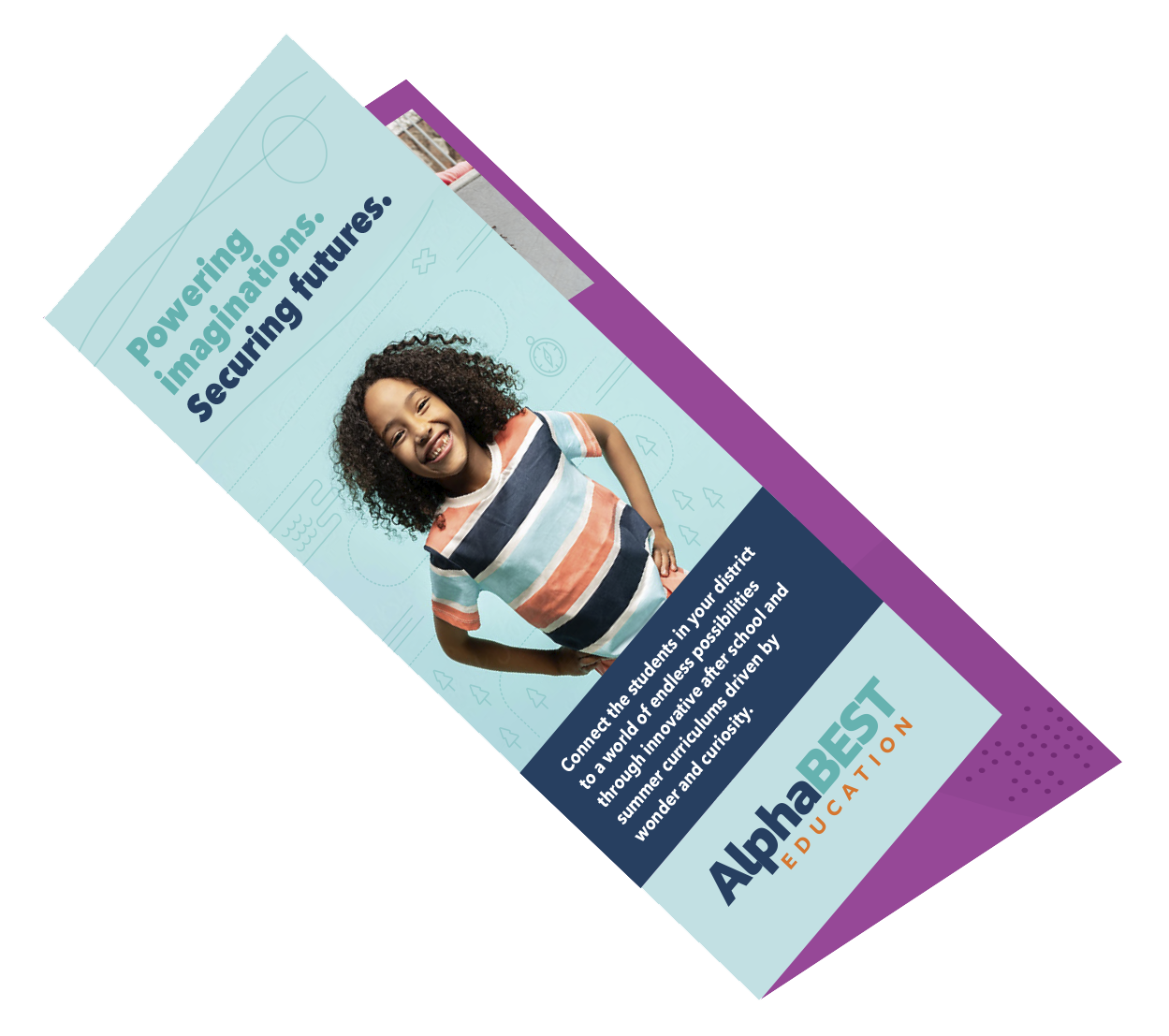
Brochure
This brochure shows just how well the new AlphaBEST brand identity work can translate to a professional audience.
ONE SHOOT, THREE VIDEOS
After the AlphaBEST brand identity was complete, and while we were putting together their new website, AlphaBEST approached us to write and produce three videos. The budget was limited, but there were three distinctly different audience spaces, so we were able to smartly repurpose footage from the longest video to create the three distinct videos they needed: an internal training video for new hires, an inspirational Human Resources video for internal viewing, and an externally facing marketing video.


